Tuesday, November 30, 2010

Upcoming Show! "Fabrications" Group Exhibition at Marx and Zavattero

I have an upcoming show at Marx and Zavattero Gallery in San Francisco on January 8, 2011!  The exhibition, "Fabrications" will include four other artists whose work is primarily drawing and all include relationships between fantasy and reality. I'm super excited to be in a strong show with other talented female artists at a gallery I have long admired.  Yeah!

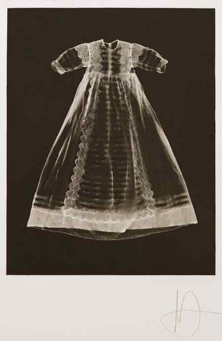
I'm an Animal, by me

Press Release:  

Marx & Zavattero is proud to launch 2011 with Fabrications, a work on paper exhibition that focuses on five women artists hailing from the Bay Area and Los Angeles who depict reality at odds with imagined states of being. Utilizing majestic iterations of critiques on society, fashion, and environmental alteration & decay, each artist’s work makes use of decisive marks to graft the external world into something less tangible. Intimate and mysterious, the work in Fabrications promises to establish conditions of suspended animation and fantasy.

Jennifer Celio’s delicately rendered graphite landscapes manipulate perception, creating delightfully naïve iterations in which artificial and natural imagery fuse to become newly impossible sites. Hinting at the contemporary threat of environmental degradation, Celio’s dense drawings depict seemingly mundane spaces that have been artificially altered or supercharged.

Melissa Manfull’s richly colored watercolor and ink works push the space of the paper into an irregular maze of dizzying architecturally impossible spaces. Tightly rendered decorative architectural elements bleed out into colored washes reminiscent of Helen Frankenthaler stain paintings, creating drawings that are in constant states of suspension – toggling back and forth between explosion and implosion – her delicate marks resemble the fragility of a dream becoming artificial oases or nightmares.

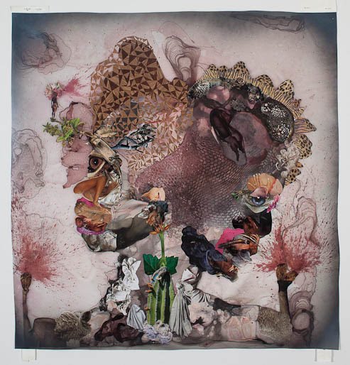
Libby Black and Serena Cole create works that highlight fashion as a starting point for fabricating new fictions. Mining the fashion world’s exoticized fantasy, Cole’s limp, emaciated models exude a pride in the dream they sell and at the same time deny and elicit a sense of desire. Constructed directly from fashion ad campaigns, Cole’s signature airy brushwork in ink, watercolor, & gouache suggests a hazy altered state and fairytales gone awry. Black’s luscious gouache & graphite drawings take desire into new realms of illusion. Using direct references to extraordinary luxury goods, Black devilishly depicts luxury and class as an empty surface. Branded goods are paired with seemingly mundane objects, or models are set within fantastical spaces that peddle the good life, all the while leaving room for reflection and her signature sense of humor.

Taravat Talepasand’s highly detailed, figurative graphite on paper pieces delve beyond the actual, accentuating her personal inventions to address the complicated cultural and surface identity of her dual heritage as an Iranian and American. Using herself as primary subject, Talepasand masquerades in a variety of iconic poses that challenge traditional hierarchies in art and society, both in the United States and in Iran.

In Fabrications each artist addresses an array of highly personalized and constructed realities that are alternately parable and horror story. The exhibition guarantees to present a visual feast ranging from the bold contrast of stark black and white graphite works by Talepasand and Celio to the lush color-laden pieces by Manfull, Black, and Cole.


Thursday, November 25, 2010

Artists I Love: Adam Fuss


"Adam Fuss: Home and the World" showing at Timothy Taylor Gallery through January 8, 2011

I don't know a ton about British photographer Adam Fuss but I think his work is beautiful and super haunting. He is currently having a show at Timothy Taylor Gallery in London, and I would love to go. Surprisingly, sometimes you can find great stuff in your own backyard, too. I discovered that Fuss also shows at Fraenkel Gallery here in San Francisco, so perhaps I will be able to see his ghostly photograms and daguerreotypes in person one day soon.

While I am no expert on photography whatsoever, I have noticed I gravitate towards these types of photography, perhaps because the way a photogram is produced is similar to a print or painting. The image, as I understand it, is made purely with the actual object placed in emulsion and light, so film is not necessary. Daguerreotypes are very old, made with some sort of plate, and associated with images like those from the Civil War. I love the idea of making it a contemporary practice. Fuss's subject matter seems to be rather particular and quite mysterious. He uses live snakes, old dresses, and what looks like smoke or fire to make his work, giving it some sort of Southern Comfort feel, like a backwoods voodoo session. Make your way over to that side of the pond if you are able! Read Fuss interview with The Telegraph here.

From the series, My Ghost (photogravure)

Home and the World (Daguerreotype)

Untitled (pigment print)

From the series My Ghost (Unique gelatin silver print photogram mounted on muslin)

These images were taken from another gallery which represents Fuss, Cheim and Read, and google.

Sunday, November 21, 2010

Artists I Love: Wangechi Mutu


"Wangechi Mutu: Hunt, Bury, Flee" at Gladstone Gallery, through December 4, 2010

I have been a big fan of Miss Mutu's ever since I learned the intricacies of watermedia. Wangechi Mutu is well known in the art world as a Kenyan-born, Yale-educated female artist who makes creepy collages combined with paint and ink on mylar. The way she harnesses the weirdness and unexpected nature of drippy pools of paint is why I have always been intrigued by her work. Interlaced within the paint are images dug from various sources, from fashion magazines to National Geographic, producing sinister social critiques discussing colonialism, feminism, and power. She does sculpture as well, and in fact majored in sculpture while pursuing her MFA at Yale in 2000. However, since the paintings are usually the highlighted work, everyone seems to like the paintings better, including me.

She has a new show at Barbara Gladstone Gallery in New York and I would highly encourage going if you have the means. She will also be giving an artist's talk on December 6 at the San Francisco Art Institute, so I will have a chance to hear her talk about her work. Yeah!

Mutu is represented by Gladstone Gallery in New York, as well as Susanne Vielmetter in Los Angeles, and Victoria Miro Gallery in London.

(These images are dense, so don't forget you can double-click for a larger window)

"I Sit, You Stand, They Crawl" 2010
"Before Punk Came Funk" 2010
"Tree Huggers" 2010
Misguided Little Unforgivable Hierarchies" 2005
"My Strength Lies", (date unknown)

The above images from 2010 are courtesy of Gladstone Gallery's website and the bottom images were found on google.

Sunday, November 14, 2010

Two Solo Shows: Linda Geary and Stephen Beal


About a week ago I went to see the painting exhibitions of two of my professors at CCA, Linda Geary and Stephen Beal. It's nice to see what's behind the curtain of school sometimes; to see where your professors are coming from on a personal and visual level. Both shows are still up so go see them if you can!

Linda Geary "Inside/Out" at Rena Bransten Gallery, 77 Geary, San Francisco (ends December 4)
Linda has been on sabbatical, which sounds like the ultimate way to live and make work; taking a salary from school for a year while they allow you to spend your time regrouping, relaxing, and making (hopefully) a new body of work. This certainly happened with Linda's paintings. The show looked awesome and truly thought-out. Each piece had color and shape that referenced the paintings around it. As a color theory teacher, it's obvious that she has a strong relationship with her colors, but it was just as interesting to see all the media that went into the pieces. There were taped-off shapes, spray-painted sections, and loose, drippy windows next to clean, tight pools. It was one of the only shows I have seen in a long while which made me want to go back and see it again.


"Stephen Beal: Recent Paintings" at George Lawson Gallery, 49 Geary, San Francisco (ends December 4)
Stephen Beal just happens to be the most important guy at CCA. He's the president. But, he is also a painter, which settles some sort of score for me and the Fine Arts program I reside in, as rumors often fly about who's budget will be cut and who is more important. Knowing that he has our back as mere makers, versus the more financially stable industries like architecture, is comforting. He also teaches a painting class for seniors, of which I am the Teacher's Assistant, so it was even more intriguing to finally see first-hand what most interests him visually. The show seemed related to Linda's in how invested he was in color. It's clear even in these two images that he has a favorite mode of working, (the grid), but the fine details and repetition of gesture seemed to share a slight affinity with Linda, as well. The two should have had a show together!


Saturday, November 13, 2010

"Alluring Subversions" Group Show at CCA


I have been neglecting my blog lately, but I haven't been neglecting my duties as an artist to go see new shows and to support my friends. A few weeks ago I visited a group exhibition at CCA's Oakland campus in the Oliver Art Center called, "Alluring Subversions", curated by undergrad Mariana Garibay. Not only did she pull off this massive show, which included 19 artists, (CCA faculty, grads, and alumni), but she put together two separate artist talks in conjunction with the exhibition. I was impressed with the show, as well as with her initiative to undertake such a feat. Congrats to Mariana, who did it all for the sake of getting it done.

Site-specific work by faculty Jeffrey Gibson

Cool ladies mingling, Maysha Mohamedi, Rachel Foster, and Kate Haskell.

Paintings by Hyun Sun Jo

Mixed media work by Catherine Ryan

New digital collage by Hilary Pecis

Hilary Pecis

Bryson Gill and his painting

Pigment installation by Abby Zialcita

Monday, November 1, 2010

Taking Inspiration from Fashion

I recently indulged in the many videos of the Spring '11 runway shows at Style.com. What is really awesome about watching the videos opposed to just checking out the slide shows is hearing what the designers and others have to say about the collections and in some cases, how they were made. Of course, the information is a lot to pack in to two and a half minutes, but even in the brief examples you can really get a sense of the craftsmanship which goes into each production.

As an artist, it is especially interesting to me to see how the designers communicate a new vision visually each season with their materials. This season I am really inspired by the creative interpretations by each designer exploring the medium of clothing and how it can possibly be incorporated into my own paintings.

I really loved the warrior hair and bad-ass bitch appeal of Givenchy.

Rick Owens had alien priestesses with these amazing hair combs.

Proenza Schouler explained the process of making this lacy material which is made on some kind of loom and then burned away.

Gucci really surprised me with these hyper colorful tribal ornamentations.

Miuccia Prada, genius as always, had these weird candy-colored furs and stripe combinations.

Rodarte had an incredibly strange production, full of woodsy references and these layered patterns.

I loved Dries van Noten's use of bleaching textiles out of his silks.

More of Proenza Schouler's painterly innovations.

Balmain's punk, dirty freakout with the most luxurious materials.

Balenciaga's super drippy chained shoes.

And Louis Vuitton's ultimate luxe beaded fringe.

I can't quite say how each of these images will come out in my paintings, but I love being inspired by the aesthetics and fantasy of fashion. I'm so grateful to have a completely new slew of mentors each season to inform my paintings.

All images from Style.com