Sunday, February 12, 2012

Words from Rebecca Morris

Just this week, the Painting Department at CCA, (of which I am an indentured servant until those student loans are paid off or I die first), started our Spring Painting Lecture Series with the Los Angeles abstract painter, Rebecca Morris.  Since I was the one picking her up from the airport, I got to talk with her and have a small glimpse before the lecture of how cool, laid-back, and at ease she was with her career, her work, and herself.  It's refreshing and motivating to meet women like that, who know who they are and what they want, with out being dicks about it.  I also read a great interview with her in the new art blog, In the Make, where you can read a little for yourself about how she answers questions about her work in a similar fashion to her lecture.

During the lecture she mentioned a manifesto she had created for herself during a year long residency in Berlin.  She said during this time, painting was considered a dead zone, not to mention abstraction.  While originally for her own notes, the manifesto ended up being a call to arms for all abstractionists, and her Berlin gallery, Galerie Barbara Weiss, ran the manifesto in an ad in Art Forum.  It became infamous and people ripped it out of their magazine copies, and it eventually became a poster.  While the manifesto is titled, "For Abstractionists and Fans of the Non-Objective", it still had morsels of art wisdom for any maker, even for the most representational among us, like me.

MANIFESTO
For Abstractionists and friends of the non-objective

BE A FORCE

Don't shoot blanks

Black and Brown: that shit is the future

Triangles are your friend

Don't pretend you don't work hard

When in doubt, spray paint it gold

Perverse formalism is your god

You are greased lightening

Bring your camera everywhere

Never stop looking at macrame`, ceramics, supergraphics and suprematism

Make work that is so secret, so fantastic, so dramatically old school/new school that it looks like it was found in a shed, locked up since the 1940's

Wake up early, fear death

Whip out the masterpieces

Be out for blood

You are the master of your own universe

Abstraction never left, motherfuckers

If you can't stop, don't stop

Strive for deeper structure

Fight monomania

Campaign against the literal


ABSTRACTION FOREVER!


I found both the manifesto and her way of talking about making things in her studio inspiring, but it also made me question what the hell I am doing in my own art practice.  Unlike Morris, I don't feel like being in my studio any time, all the time.  In my work I have to have a plan, and then I execute it.  It sort of becomes work, and not in the way artists refer to their 'work' but real work.  I'm starting to wonder if maybe I am not doing it right.  I know there are lots of different kinds of artists, and different kinds of practices, but all the painters I talk to who love being in their studio any spare minute of the day seem to be getting something different out of the process.  And I am jealous.

Morris will be showing my favorites of her paintings, the water media drawings, at Harris Lieberman Gallery in NYC on March 23-April 21, 2012.


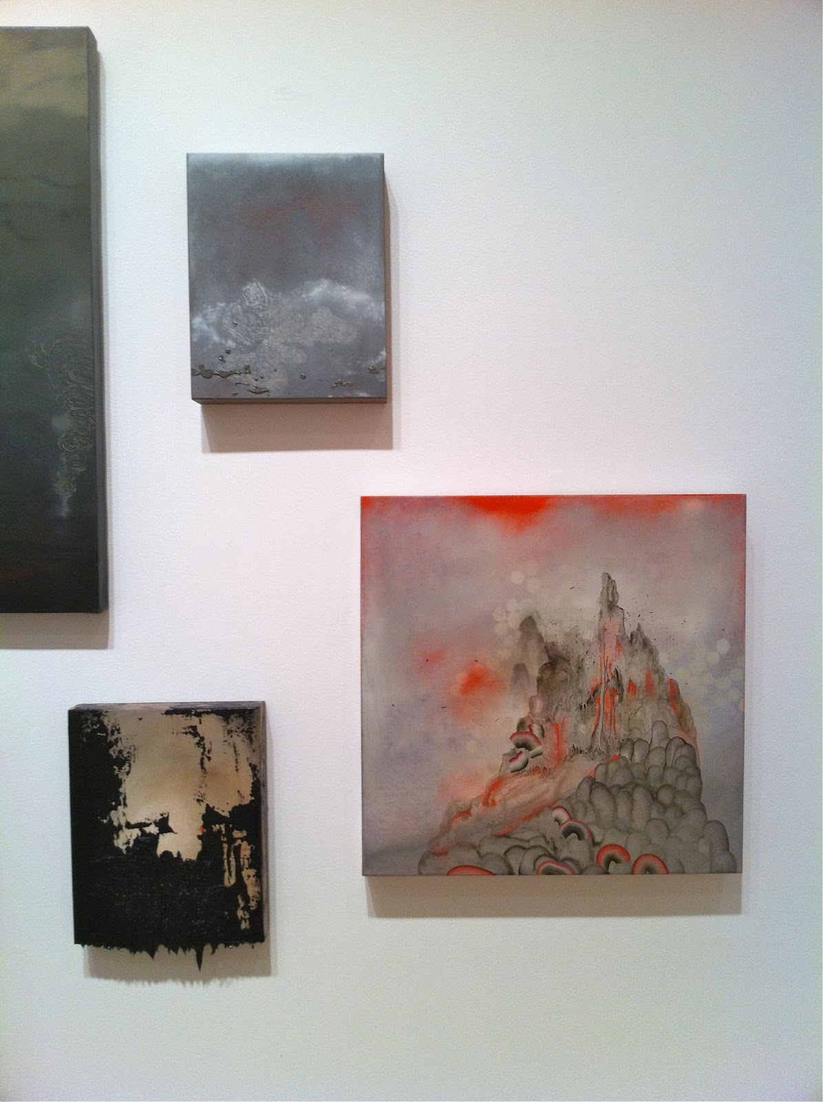
These canvas pieces are part of her larger body of work.  The more she talked about how she made them, the more I liked them.  I liked the fact that they are oil paintings but very thin, like watercolor, and if she makes a mistake there is no painting over, only wiping away and starting over.  Also, I love the spray paint and the way nothing is exact, and all made with the honesty of her own hand.  But I still like the watercolors better, because there is something beautiful about them and these paintings are not about beauty. 


All images from Harris Lieberman's website.  I found the manifesto on a blog, so it could be wrong.

Saturday, February 11, 2012

More January Openings


As an ever intrepid art explorer, I felt it was my duty as artist, CCA alum, and blogger to see the following San Francisco Art Openings.  Most of my evening out was a CCA-a-thon, where faculty, alumni, and current students all had work displayed for us to pretend to see but where we mostly chatted it up with the rest of our CCA community.  In addition to the shows at Patricia Sweetow, Haines, and Altman Siegel, I had the opportunity to see an SFAI affiliate (gasp!) and total art hero, Josephine Taylor, at Catherine Clark with my friend Libby and my little buddy Jasper.

David Huffman "Floating World", Patricia Sweetow Gallery 
(January 5 through February 11)
My former professor, David Huffman, recently made a pretty significant shift with these mostly abstract paintings of color and glitter with appearances by one of his familiar representational narrative elements, the basketball.  Huffman has included the deep space of water media and cloud-like formations in his previous, more politically explicit work for some time, and it looks like the space has taken over the narrative in a sort of tongue-in-cheek approach to abstraction.  While the basketballs reference African American stereotypes, I missed more of the action and story-telling of his former work.  With the repetition of this series, I didn't learn or think about anything past the first painting onto the next.  They are pretty, though.
Sweetow's space is a sort of in-between level in 77 Geary, with cement floors and lots of pillars.
The paintings appeared in different color schemes, like pastel and below, blacks and browns.

You know I like glitter and washes.
Kota Ezawa, "The Curse of Dimensionality" and Taha Belal, "The Atmosphere from Before the Step Down Returns to the Square" Haines Gallery
(January 5 through February 18)
I thought this show from CCA Faculty Kota Ezawa was pretty great, but it was also so crowded that I didn't get a good look at the massive amounts of work shown inside the gallery.  Kota's signature flattened cartoonish imagery was shown as animation, light screens, paintings, view boxes, and sculpture.  It almost seemed like a retrospective with the inclusion of his work from as far back as the SECA show OJ Simpson series in 2005, but I found it really inspiring that he has been able to use so many different mediums to communicate a similar theme.  
Taha Belal is a CCA MFA Alum from 2008 and a native of Egypt.  I remember his work from a few years ago of meticulously cut out newspapers, and it looks like he still uses the same techniques, but has also applied stylized patterns that the cut outs create, reminiscent of Arabian designs.  Right?  I don't really know what I am talking about.  The title of his show in the back room suggests a pretty clear message about Egypt and its political turmoil.  Belal has been staying in his country of origin, but that's really all I know.  I didn't do my homework very well and couldn't look closely at the images.
This turd with the top-not behind the counter ignored me all three times I went to get a water.    Get a grip, gallery intern, and get a new hairstyle too.
Some paintings by Ezawa, my favorite of all the mediums.
Some light boxes on the wall and the floor.
Belal's cut outs.
Group Show with Jessica Dickinson, Liam Everett, Alex Olson, Josh Smith, and Garth Weiser
 Altman Siegel
(January 5 through February 25)
I am getting to the point where I don't care who reads what I say.  The people at Altman Siegel seem really stuck up.  There, I said it.   I hate going in there- they never look up and say hello, they serve beer at their openings, and then there was the incident last summer where the asinine artist Chris Johanson asked my friends and I to leave his show because we were talking amongst ourselves during his bad-on-purpose band performance to go with his bad-on-purpose art.  All that being said, I do really like CCA grad student, Liam Everett's, artwork so I went to the stuck up palace anyway.
The same crowd moving with me from gallery to gallery.
I kind of liked this piece by Alex Olson.
Goopy.
Something weird was taking place over and over again in front of this beautiful piece by Liam made with acrylic,  salt, and alcohol.  It made a great backdrop for people to take pictures of themselves, so people kept posing in front of it, instead of taking pictures of the piece itself.  I have never seen this phenomenon with an emerging artist's painting, and I thought it was really disrespectful.
So, of course, my buddies David and Chrissie, and I had to mock what everyone else was doing.
Josephine Taylor, Catherine Clark Gallery
(January 7 through February 11)
As I mentioned, I am a big fan of Josephine Taylor's work, and have been following her beautiful large-scale ink drawings since I saw her at both the 2005 SECA show at the SF MoMA and the Bay Area Now show at the YBCA the same year.  Not many people, at least whom I have come across, make large, airy, realistic, psychological work on big expanses of white paper.  What can I say, she had me at "white paper".  In juxtaposition with her detailed and soft technique is the heavy imagery of very disturbing things.  It's amazing to have met her and know she's a very well-adjusted and lovely person, who must get a lot of things out through her art.  One more thing to like about art- it makes for great therapy.

Her pieces were mostly very large images with figures battling each other.
I really liked her choices of filling in some colors and not all.  It gave those areas more importance, and gave visual punctuations to the grotesque stories- like the balls and toenail.

The fight scene really made scary by the body language of the feet.

Sunday, February 5, 2012

Art from Forever Ago

Anything goes...
I went to some San Francisco art shows before Christmas and never posted them.  Hopefully you might be curious about some great local art anyways, especially if you're like me and want to go see a bunch of shows and but never make it to most of them.  At least we can always live vicariously through the internet. Looking back, this round of art offerings seemed especially diverse, pointing to the general truth about art in today's scene:  anything goes, and it's all good...or kind of good...most of the time.  I personally find it so refreshing that I could be making so many different kinds of paintings, and no one would bat an eye.  We have come to accept anything from glitter art to gestural abstraction on a fairly level playing field, and I love it.

Joel Dean and Jason Benson, "La Folie", and Bryson Gill, "The Optimist Gene", Triple Base Gallery 
Dec. 2- Jan. 1
Well, like I said, anything is art these days.  These pieces nailed onto other pieces and sculptural paintings as paintings/as sculpture(?) by the collaborative team of Joel and Jason in the Triple Base back room seemed almost too smart to care about what they were made of.
I like that they are different, yet I feel I've seen them before.  And like I said above, it's as if there wasn't any love put into them.
Socks as painting.
Not really into the marks made.

Bryson Gill's solo show in the front room, full of rich oil paintings and sunlight, seemed the remedy to the anti-paintings in in the back.  It was obvious that Bryson painstakingly crafted each painting lovingly, as he considered the composition and color of these paintings that were part still life and part abstraction.

That red just glows.

Paul Mullins, "For Here or To Go", Marx and Zavattero
Oct. 29- Dec. 17

Paul Mullins' large scale paintings of collaged dude imagery were nice to see in person- some art just doesn't photograph the same.  His combination of light pastel colors and KISS and dogs and tattoos was well-executed but not completely my cup of tea.  They left me wanting something more, though I'm not sure I can put my finger on it.  I just wondered through the exhibition, why these particular images?  What is he trying to say?

A close-up of the tiny painted un-collage parts.
Darren Waterston, "Forest Eater", and Leslie Shows, "Split Array" Haines Gallery
Nov. 3- Dec. 24
Well, I don't know what it is, but I kind of like this Waterston sculpture.  Maybe because it's black and matte.  I would probably like anything with black and matte.
I kind of like these Waterston paintings but he had a tough crowd because....Leslie Shows' show in the next room was so AMAZING!

Leslie Shows has been culling her experimental techniques in water media and collage for years and made an unexpected but impressive shift to paint on aluminum.  It surely left the audience wondering, how the hell did she do that?  (Notice the yellow sculptures on the floor- those are molds of objects created with sulfur.  I didn't think they went well with the rest of the show).
What was most impressive to me besides their obvious beauty and my obvious obsession with beauty,  was their seeming photorealism in their depictions of glaciers and rocks. 
A close-up of many many combined mediums to create exquisite and mysterious techniques.

I was a fan before, and I'm still a fan.

December Group Show, Guerrero Gallery
 Dec. 17- Jan. 7

Guerrero Gallery hosted a group show full of a random assortment of known and unknown talent,  but most notably featured a new sculpture by Libby Black.  Her piece, a paper sculpture of a Goyard violin on top of a milk crate with coins inside, brought a sharper political edge to her normally playful pieces.

A quilt by Ben Venom, made out of metal band T shirts.   Venom was recently featured in the last Bay Area Now show at the YBCA.  I have yet to decide whether I am sold on these quilts as much more than a cute craft.   
A piece by Richard Colman, which I didn't realize until now is grip tape on something called 'bonite'.   I kind of like it more for this, but it makes it something much more high/low than a boy making a glitter painting.  I don't know what that means, really, but it's interesting.
Paul Wackers makes nice paintings.
Dude art of alien sex.  Typical.  (By David Jien)
A gold flag by Andrew Schoultz, who recently had a very good December in Miami at the fairs with similar gold prints.  Even Diddy, or whatever he's called now, wanted one.
Nice job, San Francisco.

Thursday, February 2, 2012

Artists I Love: Ingres

Jean-Auguste-Dominique Ingres, I love you.  


The french painter, Ingres, is mostly known for this AMAZING image of Napoleon on his imperial throne, as well as the odalisques like the one below.  While perhaps not an unsung hero, but I wonder if he gets the due he deserves in the history of art.  Perhaps he does, but until recently, I don't think I paid enough attention to his exquisite paintings with their subtle plastification of the figure and their intense homage and servitude to beauty with a capital B.  *Don't forget you can click on the images to enlarge them.


Around the time of the French Revolution, he studied under another absolute favorite, Jacques-Louis David, who I found out through wikipedia said Ingres had a tendency to exaggerate in his work.  That in itself is probably what makes me love him so much.  As a sort of new Mannerist, exaggerating proportions slightly is what makes the real uncanny, and draws us in and slightly confuses us at the same time.  I will let you read the rest about him here.


His tendency to apply rich and ornate patterns, fabrics, and jewels only heightens the sense of sumptuousness to each portrait and take it a little over-the-top, and in Napoleon's portrait, a lot over-the-top.  Of course, in the tradition of portraiture, the wealthy were the ones commissioning portraits of themselves to create an opulent and fantastical, beautified avatar of themselves, if you will.  However, I read in a book about him that he reminded the women in his portraits to bring all of their jewels, as if he knew that would bring them beyond a basic portrait.


What I really found illuminating and inspiring in my recent study of Ingres simply for research for my own work was a book in the CCA library, Portraits of Ingres: image of an epoch, which included all these lovely paintings we have seen before, but also his understated portrait drawings.  It's the small things in these drawings that inspire me so much- his use of light rendering and strong lines, as well as small details that call attention to the frame of the image, and his placement of the horizon line that play with the idea of a standard portrait.  I took some photos from the book just for my own reference.

I love the way he has drawn an image of an image, with a decorative symbol on the outside of the frame.
The simplicity of line in her arms and dress combined with her  rendered hair and eyes is really refreshingly light.
I love her sassy attitude and all the crap she is holding.
Another simple line drawing of the outline of the body.  I also love the column-like placement of standing figures straight down the middle of the frame.
The way the horizon line is placed so low brings the figure into a setting but removes him from  its proximity.  It also makes the figure seem larger and grander than if he were placed in the middle of a scene.

I love portraits, I love Beauty with a capital B, and I love line.  There, you got me.  I'm an old-fashioned romantic in a high-tech, soul-stripping art world of fast and easy projects.  Here's to the real dudes:  Ingres, David, and Bronzino.


PS I found all the images of his paintings from google and have no rights to them.